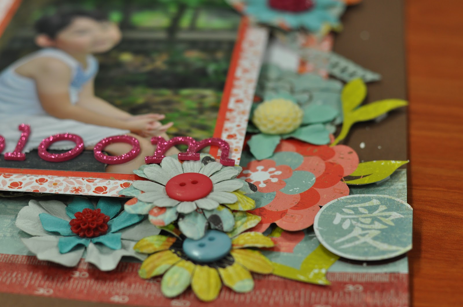
Monday, June 18, 2012

Websters Pages: Adore


School's starting in a week's time, but I could hardly find any motivation to work on serious stuff except scrapping. Been thinking about a melting pot recently. If only, I have another month of holidays to play with it.


As you can see in this layout, I'm still on the wooden flourish vintage dreamy craze. And the websters pages are just so apt for this theme.
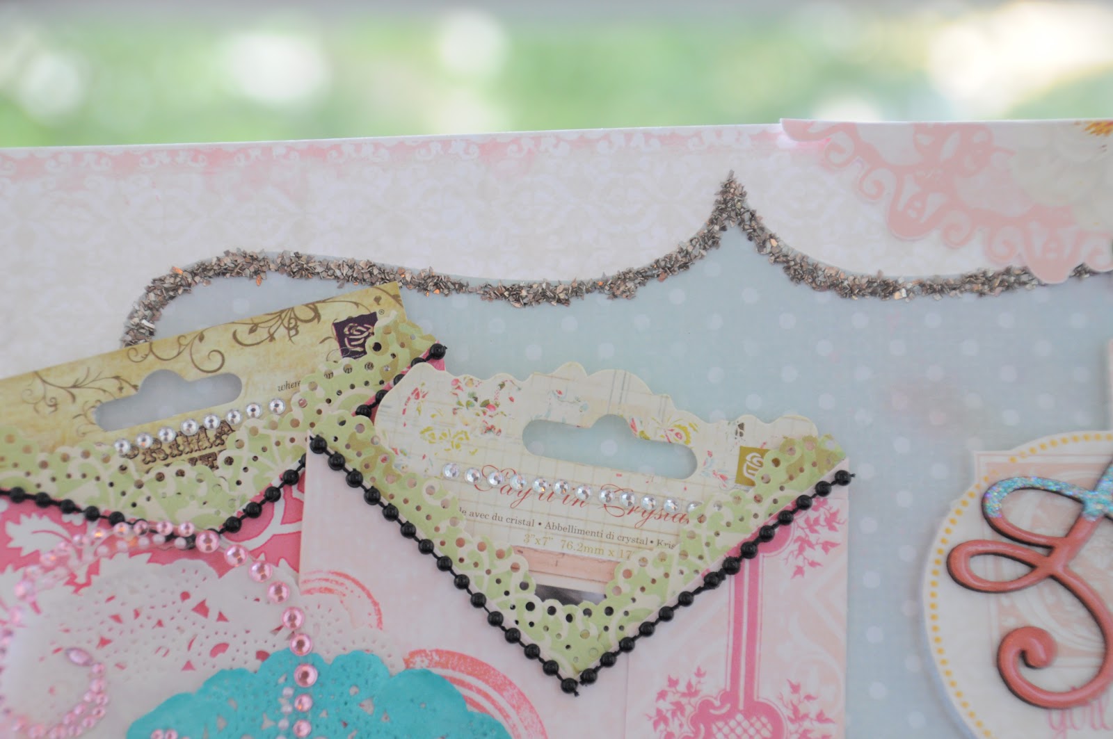

The lucky 8 punch I bought so eagerly @40% discount is finally used in this layout. I should have waited for 50% discount. So for those of you who have yet to purchase them, do grab them before the discount ends. It's really versatile and easy to use.

It's probably not obvious in the photos, but I've tried to mist the 2 doily papers. One in French Vanilla, to give it a kind of shimmer white look and the other in aquamarine. I quite like the subtle effect of the French Vanilla.


I've also tried to create pockets for additional photos and journaling in this layout.


I like how the tags turned out on the recycled prima packaging labels. Aren't they pretty. And think about the money you're saving instead of using those journaling tags sold in a pack!


The kaiser craft wooden flourish. I tried to layer the top with blue stickles instead. I think I prefer the toning effect better.


Recylced tags from the prima packaging.


I simply love how the little bit of pink turn out on the white roses. That's achieve by simply using the left over ink on the sponge which I used to colour my wooden flourish.

This is indeed quite a cost saving layout! I like!

Materials Used: WebstersPages Pattern paper, Melissa Frances Pattern Paper, Kaiser Craft Wooden flourish, Prima flowers, Melissa Frances Glass Glitter, Tim Holtz metal key.

Saturday, June 16, 2012

It's Published


I'm very happy that two of my layouts were featured in Scrap 365 Magazine. This is a new scrapbooking magazine that has lots of cool scrapbooking techniques and sketches.

My first layout, published in the March issue.


My second layout, published in the June issue. 


And I hope there's many more to come, though not much luck recently.

Friends Forever


I've tried to incorporate all the Japanese scrapbooking essence in this layout. It's somewhat vintage, but not too brown. Tea dye distress over vintage photo. The blings and the pastel colours. The dreamy effect. And of course, the need for a frame structure.


I've created the frame using a lace stamp and metallic gold Staz On, bought by my dad from Japan last year. He has been bugging me to used it for the longest time but I couldn't find an occasion for it. I thought it look perfectly nice and apt in the Japanese style design.

The swirls in the background were created using prima mask and a mixture of pastel colours ink. I had fun dabbing the ink over the mask to create the dreamy effect. I've also added some little pebbles I bought from the craft store in Japan. Not forgetting to mention, I made the roses myself too. I love how it turn out so sweet with the sparkle on its petals.


I love this part the most. I got the idea from a scrapkit Joyce bought from Japan. Basically it's to ink the wooden flourish with white ink and then create a toning effect using another colour. After all is done, a little patience in lining it with glossy accent for the glossy effect. Super love this technique.

 
Lots of effort has also been made to fussy cut the flowers and fairies from the G45 papers. I realized that the flowers from the recent Ladies Dairy collection complements the fairies from their older collection very well. I've also added some dried flowers as embellishments in the flower cluster. No prizes for guessing where I bought them from. I really love the craft stores in Japan. Wished I had more time to explore more.


Finally the last part, I lined the frame with some glass glitter from MF.

I definitely have many areas of improvement in this Japanese style, but I will try my best to do a better one the next time. I hope you like the dreamy effect as much as I do.

Materials Used: Prima Reflections pattern paper, Graphic 45 Once upon a Spring Time pattern papers, Graphic 45 Ladies Dairy pattern papers, Kasier Craft Wooden Flourishes, Kasier Craft Friends Rub-Ons, Prima Swirls Mask.

Tuesday, June 5, 2012

7 Gypsies: Life is Beautiful


A layout I completed quite some time ago and I didn’t blog on it as I was hoping that it gets accepted by a magazine for publications. Unfortunately, it didn’t. L
However, I thought I do really wanted to share this layout as there are some really cool techniques involved.


The photo is actually a transfer image onto a sticky backed canvas. Instead of using gel medium, you could just use the photocopier paper and paste it on the sticky side of the canvas. Then using water, slowly rub off till you see your image forming. I thought this method was pretty cool and the transfer turns out to be so much better than using the gel medium. In fact, you can also do this on transparent sticky tape as one of the layouts I’ve done previously. I’m not sure if the clarity was also due to the fact that I used a hair dryer to dry instead of my heat gun (as it was lost under the huge pile of scrap).

I liked this photo a lot; however, I think there is something about it that is not favourable to the magazines. I like the huge empty space created by the photo. It gives me the space to journal or to stamp a good sentiment.

I also had good fun inking and stamping the plain cardstock to create the background.


The title was created without the use of chipboard stickers but the pattern paper itself. To make the words stand out more, I’ve used ranger black enamel.

I hope this layout will inspire you to try the image transfer technique!


Materials Used: Sticky back canvas, 7-Gypises pattern paper, Prima flowers, Ranger Black enamel, 7 Gypsies canvas tape, Tim Holtz tissue tape, Stampers Anonymous

Friday, June 1, 2012

Chloe’s Second Layout


Chloe’s very good at giving orders nowadays, or perhaps rather, excuses for her to dabble into scrapbooking. 

The little one first wanted me to scrap a card for her teacher who’s leaving. Then she decided to push her luck further by wanting to scrap a layout instead of a card. And honestly, I think she finds more joy in scrapping the layout than the original intention of scrapping as a keepsake for her teacher.


Anyways, we did this layout last weekend. We didn’t really spend too much time on it. I took the easy way out by using papers from the same brand. So I had little trouble mixing and matching them.
Most of the layers are created using the congregated board. They are really good and cheap to create the pop up effect.


Chloe helped in the painting of the stencil of letters in the background with acrylic paint and the stamping of the words along the edge of the pattern paper. 


She was good with the tape glue and could follow most of the instructions to where each item should be placed.  She also played an active role in popping up most of the embellishments.


All in all, the scrapbooking activity with the noisy one didn’t turned out too bad. I do look forward to the next one. Hopefully soon. J

Thursday, May 31, 2012

Graphic 45: Magical Curiosity Shoppe


Greetings from Japan, Osaka! It has been a hectic month of May with work at school. Just before May ends, I better share this layout on the blog before the cobwebs starts growing here.

I was so busy that I hardly had time to drop by Papermarket. However, on a rare occasion where I did manage to sneak out some time to drop by Papermarket@CM, Irene was trying to clear the Graphic 45 curiosity paper, which I super love. Hence, decided to try to make a sample for her to let the customers at CM better appreciate the beauty of G45.


Disclaimer: I scraplifted this layout (as usual) from a magazine which came from one of the G45 designers, Tara Orr. She used the Once upon Springtime Paper in her layout, whereas I tried the same concept using the Old Curiosity Shoppe paper. Definitely not as nice as hers, but I enjoyed the process of inking and distressing.


This series of G45 papers is just so lovely. There are just so many things/embellishments that you can cut out from the pattern paper. Imagine the amount of money you’re saving. One piece of pattern paper has like a dozen beautiful butterflies! Glossy accent them, and you have like a huge pack of beautiful glossy butterflies.


I’ve also tried to incorporate the lovely vintage pocket watch and glass bottle by Tim Holtz. I thought they blend in pretty well in the vintage shop.


The background was stamped with the reflections words stamp by Stampers Anonymous. But seriously, you can always use other background stamps to substitute. A good one would be the mixed media stamps, also by Stampers Anonymous.


And if you need any ideas on how to use these papers, you can easily hop on any of the G45 design team blogs, where they have fantastic ideas to share.  My favourite, of course Sharon. J

Anyways, the layout is at Papermarket@CM. And the promotion for the G45 papers is 10 for 10. So do quickly get hold of these papers, if you like the vintage and nostalgic feel. And the Stampers Anonymous rubber stamps are going one for one too! Seriously, grab them before they’re sold out!

Materials Used: Graphic 45 Old Curiosity Shoppe pattern papers, Tim Holtz pocket watch, glass bottles and stickers, Prima flowers, Doily papers, Glimmer Mist, Distress Inks Vintage Photo and Walnut Stain.

Wednesday, May 16, 2012

Amazing $12 Deal @Papermarket


These 2 layouts are only going for an amazing price of $12 only!!! @ Papermarket in June. Definitely not a deal to be missed. This is also my first time having the opportunity to work on a sample. Yeah~ One more step closer to my aim of getting my ideal job.

I love how the layouts turned out just by using pattern paper and nothing fanciful.


The first layout, had those lovely ribbons punched using EK punches. 


As I was told to scraplift the layouts and I didn’t have the punch. You can imagine how fortunate it was for me to just drop by Papermarket@Clementi Mall and get it. It turned out to be a very nice punch and I’m glad to get it for a 40% discount. So if you like it, do drop by any of the Papermarket outlets before the promotion ends.

The second layout main attractions are the pin-wheels and the mountain folds. 


I love how amazing the ordinary papers can turned out to be so not ordinary by just adding a little twist to it. In fact, when I first got the pack of papers and embellishments to work on, I was like ….. Oh no, how am I to transform these papers to something attractive. But I seriously think I did it.  
All in all, do try to sign up for this class. It’s really worth it. You can learn how to layer and create many interesting backgrounds!

Materials Used: Basic Grey Konichinwa pattern paper, cardstocks, prima flowers, buttons, acrylic paint, EK punch, 7G tissue tape.