Friday, March 30, 2012

I'm a Tim Holtz Fan

Okay, this is the last entry for the day/night. I promised. Sorry for the huge number of posts today as I haven't been blogging but I've been creating. And there is just so much that I wanted to share!

I bought this yesterday, wanting to scrap something for myself in the month of March.


When I finally reached home late at night, I thought of making something really simple and fast. Since the frame is already so pretty, little needs to be done. However, slowly and gradually, I turned this sweety frame into some really grungy thing like this.


Ha! Dear calls it a pool of shit. Then later, he was a little nicer, he calls it ice-kachang now. Because of all the red, green, blue colours.


I wanted to created the crackle paint and distress stains over it effect, in his book Compendium of Curiosities (Book 2). Perhaps I haven't done enough of planning for the colours. (that's why it looks like ice-kachang). However, I do love the randomness.


The background was done with the technique I learnt in the online class.  


And I love creating the sides of the frames using all the metal charms.


I really like how it turned out and enjoy looking at it while I worked through the painful work in school!

Tim Holtz Chemistry 101 Day 5

I like Day 5 best so far! As I have almost all the materials required for Day 5.


Day 5 is very much like Day 2, with very similar techniques with a little twist.


Tag 1, uses the ink blending technique on a craft resist cardstock.


Tag 2, uses the stains.


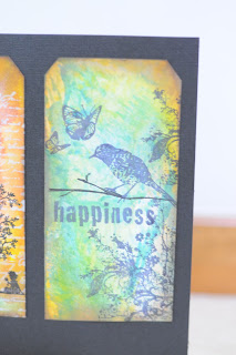
Tag 3, uses stains to create the marble effect. The key to tag 2 and 3 is the lovely
chemistry behind the distress stain, picket fence. It's a lovely stain with unique
properties. Another secret in this tag, I hand drawn the branch the bird is sitting on, as I didn't have any
stamps with bird and branch.

Tim Holtz Chemistry 101 Day 4


The lessons are getting more and more exciting.


The first tag was supposed to colour the vintage Tim Holtz stamps using the re-inkers with the fabulous water colour brushes, which Simon Says is still happily (and slowly) shipping them to me. So being left with no choice, I coloured using my distress ink pads on craft sheet instead! Thought I did a wonder job in getting the inks. Though, I know Freddy would definitely yell at me for those hard lines at the background and all around.


Tag 2, was supposed to use re-inkers in misters to obtained the misted look. Well, I didn't have the re-inkers then, and definitely I also do not have the space to purchase more than 1 mister. So I substituted the whole process with my glimmer mist instead. And I thought it didn't turned out too bad either.


My Tag 3's a disaster. I desperately needed the four butterflies in a portrait stamp before I can perfect this technique. It's a very cool technique using the cut and dry felt and the re-inkers. You can actually get to custom make your own ink pad using the cut and dry felt! However, I had a bad stamp. Will work on it and produced something better the next round!

Tim Holtz Chemistry 101 Day 3

Day 3, didn't work out quite well as I didn't have the Tim Holtz pattern kind of stamps. I was more or less trying work with what I have.


For the first tag, it uses alcohol inks on gloss paper. It's amazing to see how these alcohol inks blend together using the blending solution. It's pretty much a brainless kind of art. And I enjoyed such art!

The second tag is what amazes me. The gloss paper by Ranger, allows you to rub distress inks on it! Amazingly, the distress inks stays! As the gloss paper made by Ranger has a clay like porous surface! Wow, so much of the chemistry!

Tim Holtz Chemistry 101 Day 2

There isn't an entry on Day 1, as he shared about the different types of inks and their properties, rather than any techniques. Hence, no HOMEWORK! Yeah! And that made me perfectly understands how my students feel about HOMEWORK.


For Day 2, it's working more on the distress inks and blending them using the blending tool. Lots of exploration in getting the distress inks to react with water as well.


Lots of exploration in getting the distress inks to react with water as well.


And it's beyond words to describe how happy I was when I managed to get the brushless watercoloured effect. Tried to do it some years back using the zig-zag markers, but it turned out really muddy. Was glad the good old distress inks managed to do the trick, without a brush!


First Try @ Mixed Media

There has been so much talk and videos about mixed media, that has got my hands so itchy to try at it. So finally during the March holidays, I've decided to give it  ago.


Definitely quite a noob piece of art. Background was created with sticking lots of pattern paper on a sticky back canvas and white washing it with white acrylic paint and highlighting with other colours. I think I could have done better with the highlighting of other brighter colours.


However, I think I enjoyed the process of doing the collage and getting all the odd pieces of stuff together.


Handmade flowers using tissue paper tape.


My Favourite butterflies. And I thought they look nice, with the golden pearls instead of the usual blings.

Materials Used: Sticky Back Canvas, Lots of Pattern paper (I really can't recalled what I've used), 7 Gypsies tape and tissue paper, Tim Holtz tissue tape.

Thursday, March 22, 2012

Tim Holtz Chemistry 101 Online Class


Yes.. I'm excited.. Very excited... Too excited... ABSOLUTELY Excited!!!
Tim Holtz is having this online class, where you can really get the first class seat, and learned all the all so cool techniques!
I can hardly wait for the weekend to get my hands dirty and start making some of the tags.

Wednesday, March 14, 2012

My Little Shoe Box Scrapkit: Happy Sunshine

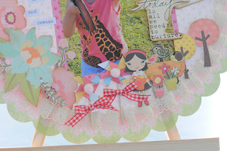
This is another scrapkit meant for beginner scrappers, or for even children!

I’ve bought these papers quite a long time ago, but haven’t got the time to scrap and fussy cut all the little stuff. Or rather, perhaps not in that cheery mood to do a bright colour layout.
I like the little windmills created here.

And the beetle pegs, which I’ve been wanting to buy for quite some time and needed a use for it.

Materials Used: My Little Shoe Box pattern paper, Echo Park pattern paper, Tim Holtz stickers and paper clips.

Beautiful Always

I love creating backgrounds. This layout is inspired by Tim Holtz video on using perfect pearls.

Perfect pearls bonds very well with water. Hence, I stamped the images using distress ink, which is very watery ink and put the perfect pearls on top of it while the ink is still wet.

Following Tim Holtz instructions, I spritzed it with some water for the ink to run, before drying using a heat gun. As you can see, the first row of images, stamped using barn door, the ink ran too much. First time doing it, not experienced enough. The other two images, stamped using walnut stain turned out much better.

The background of the paper was then created using a mixture of distress inks, peeled paint, spiced marmalade, stormy sky, vintage photo, walnut stain.
I wanted to dry some mixed media today. So I used the story book paper to create the effect by sticking it down using matt gel medium.
But I guess I need to be more daring and stick more paper and white wash it more.

If you look close enough, the background also have some glimmer paint stamped images. It’s another of my newly bought gadgets.

I like how the background turned out in this layout. I hope you like it too!


Materials Used: Manila cardstock, distress inks, 7 Gypsies pattern paper, tags, G45 tag envelope, metal tags, ribbons, Tim Holtz alpha cards, metal charms and key, Unity Stamps.

Saturday, March 10, 2012

Chloe's First Layout @ 4 1/2 Years Old

As I didn't have classes today, I decided to pamper Chloe a bit, by giving her a one to one personal START class.


She didn't do quite badly. I thought she cut well, considering she was using a less than a dollar scissors. She asked for the edge distresser to distress the sides of her paper, which did shocked me quite a little. But that came only after she stuck everything on the cardstock. So too bad, too late. And she also specifically requested she wanted the pom pom at the bottom of the layout. She loves the foam dots and was acting like a big girl in deciding which embellishment to pop up.

It's really lovely to scrap with your kids. It's good interaction and fun. Hope those with kids out there will try and have as much fun as I did.

Laines, where It all Begins...

My first interaction with scrapbooking is when I got Karen to do some souvenirs for the guests attending Chloe's first birthday party. I wanted something unique and memorable. Karen being a very good scrapper, did fantastic souvenirs that was exactly what I wanted.


Subsequently, after admiring the souvenir Karen did for a long time, I decided to signed up for SDU@ Laines. Didn't know why I choose Laines over the other store. It was just coincidental. Since it was the June holidays when I started SDU, I had all time in the month to scrap and buy stuff. Throughout that month, I was practically at Laines even before their shutters was raised.

I love the smell of Laines, the smell of borders, the smell of wheelock. The moving out of Borders was sad enough. And now Laines. Sigh~

Decided to remember Laines and my beginnings in this blog entry by posting my first layout. (Pretty horrible now that I look at it.)


I really love the warmth and helpfulness of all the people who works/worked @ Laines. I really love the family feel, which I guess it's why when I'm feeling down, that's the first place I go to.  

I end off this post with my second humble beginning @SDU with a 2 page layout.

I remember how impressed I was when Sharon showed me how to distress and introduced my first love, glossy accent.

Wheelock will never be the same without Laines. But I believe, the family feel of Laines will be the same if not better at the new home.

March Merly Sketch Challenge

I love this month Merly Sketch Challenge.


Coz there is a cool butterfly that is double layered. And Graphic 45 has it's lovely metal butterfly with brads? That's just exactly what I needed to complete this sketch.


I loved the tab part in the sketch and wanted to make it a little more interactive. So I recycled the same technique of the pull out tab, for more journaling. Though, it's a overuse idea, I thought it was quite apt in this sketch.


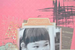
I layered the background with quite a number of different things. I love the brown woven thing. (I don't know what's its called, but I love it) And also since this layout is meant to leave lots of empty space, I decided to play with some paint. I so happen to found my credit card which was missing for months (already had a replacement, so it's a useless card now) and use it to create streaks of black. I love the way it turn out as a background behind the photos.


Did this layout while camping overnight in school and manage to find some Tim Holtz film strip around. Love how it turn out with the wordings and black and white photos.


The final layout


Materials Used: Authentique pattern paper, Prima pattern paper and flowers, Graphic 45, old curiosity shoppe butterfly, metal butterfly and brads, Tim Holtz Sizzix film strip die, Echo Park pattern paper, Trims.

Sunday, March 4, 2012

Graphic 45 Unique Sweet Secrets

First, I need to thank Sharon for linking my blog to hers. I'm so touched. She's such a nice and powerful shifu. And I'm really happy that she's one of the top 30 finalists in the G45 call for DT. Hopes she gets in and I could hardly wait to copy see her fantastic projects. She's such a good scrapper and can easily create brilliantly beautiful things out of nothing. How I wish one day I can be like her.


Just like shifu, I love vintage stuff. Hence, I have been keeping the new curiosity paper till I have something better and more concrete in mind. I thought I had it today. Unfortunately, it didn't turn out to be what I expected. Probably next time it would be better.

Though, there are still a couple of new things that I tried to play with in this layout. I've glossed the butterflies and use a penknife to carefully lift their wings off the paper, creating more volume to the layout.


Tried using the wooden spools to wind the ribbons. Had fun dabbing the metal flowers with alcohol inks. And I love Graphic 45 packaging tags. They are so good to use as backgrounds.


I wanted to create a little shop that sells vintage and random stuff at the corner of my layout. But it didn't turned out too well. Hence, these vintage random stuff are clustered at this corner rather than "the shop".


Also tried my hand at Prima's resist canvas. It didn't turned out to be what I originally wanted. I wanted it brown with a tinge of gold, and some green (signifying moss) at the edges. Unfortunately, the brown was too empowering. I should have watered it down more.


But I love the new Graphic 45 pegs. They are so lovely. I was desperately trying to find a space to fit this in. I guess this is the only place that would fit.


This is also the first time, I tried creating a "secret pocket" for journaling.


Materials Used: Graphic 45 Curiosity pattern paper, Metal flowers, trims, pegs, envelopes, Prima resist canvas, Tim Holtz brads, tags, glass bottles.