Coz there is a cool butterfly that is double layered. And Graphic 45 has it's lovely metal butterfly with brads? That's just exactly what I needed to complete this sketch.
I loved the tab part in the sketch and wanted to make it a little more interactive. So I recycled the same technique of the pull out tab, for more journaling. Though, it's a overuse idea, I thought it was quite apt in this sketch.
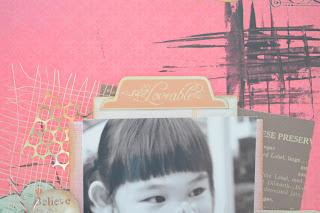
I layered the background with quite a number of different things. I love the brown woven thing. (I don't know what's its called, but I love it) And also since this layout is meant to leave lots of empty space, I decided to play with some paint. I so happen to found my credit card which was missing for months (already had a replacement, so it's a useless card now) and use it to create streaks of black. I love the way it turn out as a background behind the photos.
Did this layout while camping overnight in school and manage to find some Tim Holtz film strip around. Love how it turn out with the wordings and black and white photos.
The final layout
Materials Used: Authentique pattern paper, Prima pattern paper and flowers, Graphic 45, old curiosity shoppe butterfly, metal butterfly and brads, Tim Holtz Sizzix film strip die, Echo Park pattern paper, Trims.


No comments:
Post a Comment