Tuesday, December 27, 2011

Altered Art: Bird House

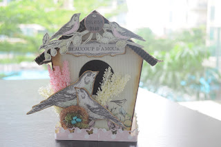
This is my first time working on wooden board altered art. I bought this sometime ago, wanting to scrap it for my best friend as a gift for her new house. However, it wasn't till recently that I finally forced myself to scrap.


 It's not such a difficult project as there is a picture to follow in the package. I just need to modify some of the things that I do not have and add a little more embellishments to my liking.


The whole birdhouse is decorated using the Kaisercraft Bonjour collection.

The roof is decorated using Martha Stewart doily lace punch on kraft cardstock. On hind sight, I regretted not inking the doily lace. I thought inking it might make the roof stand out more.


The original picture used a fence punch for the base. Since I didn't have that punch I substituted with the butterfly punch which I thought was quite cool too.


Finally for the top, I used Tim Holtz metal sentiments again. I noticed that Tim Holtz is very much into 4D too. All his metal sentiments have 4 digit numbers. I didn't used this particular number in the end, as I thought the number is not quite nice. I changed another one, which would not be shown here to give my best friend the privilege for being the only one who knows what is the lucky number is! All in all, I hope she likes it.


Materials used: Melissa Frances Bird House, Kaisercraft Bonjour Collection, Ribbons, Punches, Tim Holtz philosophy tags.

Canvas Painting Part 2

I haven't been slacking around this holiday though there hasn't been much updates. I'm still actively involved in the arty hobby. As part of my wedding anniversary celebration, I went back to Arteastiq for another round of canvas painting.
This time round, they had the free upgrade to a larger piece of canvas. I decided to challenged myself to something more textured.


I didn't have time and resources to complete the textured portion.


The textured trees was achieved by using extra body acrylic paint which I bought from Art Friend. I like the way it turned out, though its still a long way from the original piece of art.

We wanted to bring Chloe to try the following week where they had the one for one promotion. However, it was fully booked. Hence, to keep to our promise, we decided to paint at home!

This is her first art work, completed after 3 nights of painting.

Monday, December 12, 2011

Home

Sorry for the lack of updates. Had been having a very hectic life since November with work, travel and family. And of course, also the fact that I wanted to scrap something with respect to a given theme by the UK magazine. I have NEVER scrap anything with a specific theme. Hence, that's the challenge, which took me almost a month.

Home... I've thought of using pictures from my current house, or even family photos, but somehow, it didn't sparked off anything creative or unique or special. Hence, the procrastination of scrapping starts. Not until recently, where I suddenly felt the pinch that the place I used to grow up in is going to be demolished soon. That's where the emotions came in and I decided to scrap my first home. Regardless of whether or not it gets accepted by the magazine, to me it's something worth the effort.

This layout involved some techniques. It's not that difficult, if you're an avid scrapper.

I self made the flowers from the scallop punch. I was practicing for a design class that I'm supposed to teach. So if you like it, do try to check out Laines for the design class.


I gave the Tim Holtz glassine paper some embossing and this time round decided to use crackle paint instead of gel medium to try a different feel. I would say I prefer the gel medium.

I also sand the edges of the photos to give it a more nostalgic look. In my scrap classes, I noticed that quite a number of students were rather reluctant when it comes to sanding. Basically, there are still quite a number of conservative scrappers around. I always like it when students are more appreciative of the vintage and rugged techniques. Or perhaps, maybe I should challenge myself with the no tearing, no distressing challenge. Some day perhaps.


Materials Used: Prima pattern papers, Webster Pages, Simple Stories pattern paper, Tim Holtz ideology embellishments, ribbons, Tim holtz tissue paper

Wednesday, November 16, 2011

Sweet Angles

I found paradise yesterday. Yes, I found Magnolia pattern paper somewhere in Singapore!!! Woo hoo... it was an unexpected discovery. Joyce and I were so excited that we decided to do a Magnolia challenge from late yesterday night till this morning around 2 am?

This is the result of my challenge!


What's Magnolia, without the iconic Magnolia girls. I used watercolour crayon for that part, instead of copic markers. I'm still a noob at colouring, especially so for the Magnolia girls. As they do not have any picture to follow, I have huge difficulty. This project has increased my temptation to sign up for the Magnolia stamp classes @ Artist De Junior @ Velocity. Maybe... Maybe... My Christmas present to myself. I backed the girl up with a Prima window. I like the way it turned out.


And now's the part on decorating each corners. Did a Prima mask with distress ink, doily lace one on top of each other to create dimension, recycled a backing from Prima flowers, tags from MME (on 40% @ Papermarket and Laines)...


Cut flowers from Webster pages, mixed them with Prima flowers (usual trick)...


Metal butterfly from some handmade jewelry shop and its really cheap...That's the thing about scrapbooking. Well, you can really scrap from anything. You need not lament that the items sold in scrapbooking shops are expensive as you can always go out to non scrapbooking shops to hunt for stuff. And you will be surprised with how much non-scrappy stuff you can get and eventually they just fall perfectly in place with your layout!


Webster flowers with Prima centres...

Webster pages lace where I folded two layers, again for dimension purposes... and not to forget the fake stitches. As the background is rather whitewashed, the faked stitches in black ink really brings out the whole layout. This is something I always liked to teach the students in START classes.


I might try to work on a similar one with HOME as a theme for one of the UK magazine. My dateline is 16 Dec. Hopefully it would turned out nice and I can be invited to be their guest designer... Cool...

Materials Used: Magnolia pattern paper, Tim Holtz paper stack, Prima flowers and embellishment, Webster pages, Magnolia stamps, Webster ribbons, Martha Stewart Doily lace punch, Prima brick and corner masks.

Sunday, November 13, 2011

Altered Pencil Holder


This project motivation comes from my mum. She has collected lots of these toilet rolls and has been asking me to scrap it to a pencil holder. When I repeatedly ignored her request, she started making them by herself which was totally not scrappy at all.

I started by sealing the base of the holder using a chipboard, so that it is thick enough to withstand the weight of whatever you want to place in it. The trick here is to use a sanding block to sand off the extra bits of chipboard that did not blend into the sides.

The whole holder was then covered with gesso and 7 Gypsies Song Bird tissue paper. After it was dried, it was then sealed with gloss medium. After the gloss medium, I cut some flowers from the 7 Gypsies pattern paper, and sealed then again using gloss medium. The repeated coats of gloss medium gives the holder a sturdier look. Patience is the key. You need to wait for the gesso to dry then apply the gloss medium.


After the main body is complete, what's left it's the exciting part of embellishing the whole thing. Decided to keep it simple, using 7 Gypsies trims on the top and bottom (to cover the ugly connections), Tim Holtz sentiments and of course Prima flowers. The butterfly and the wordings were embossed using Aged Gold, my favourite embossing powder for the year!


Since my mum has lots of these toilet rolls, I'm intending to recycle them and make them into these pencil holders as Christmas gifts for my daughter's teachers. I wonder if it looks too cheapskate?

Materials Used: Recycle toilet rolls, 7 Gypsies Life is Good, 7 Gypsies Ribbons, 7 Gypsies Tissue Paper Song Bird Collage, Prima Flowers, Stamp Anonymous, Tim Holtz Philosophy tags.

Canvas Painting

It's been a tough time at work for the last two weeks. There were things that I cannot reconcile with, hence scrapping has taken a back seat.

Amidst the stress and frustrations, decided to go for something beyond scrapping. The most basic form of art, the fundamentals of art... Drawing and Painting! There is this nice place, Arteastiq @ Mandarin Gallery that provides canvas painting, with brushes, canvas and a free drink for $48. There are different promotions for different days, for example, Monday's Romantic Blue Date where you get a 1 for 1 deal (for couples only); Tuesday's True Friendship Day, etc etc. You can check out their website www.arteastiq.com for further details.

As for me, I am never a good student in art. Remember the days where art was a compulsory and examinable subject in school, I practically got criticized by my teacher for every single lesson. So with apprehension and skepticism,  I decided to give it a try.

The sketch...


And the final piece.


I was lucky that Joyce was with me. Towards the end, I was rushing to finish the background and had difficulty with the fine details. The more nervous I get, the worst it was. I kept painting out of line. Of course, at this moment, Joyce the heroine came to the rescue! If you look carefully, there are many areas for improvement. However, after this experience, I do look forward to my next painting session. Hopefully the wait wouldn't be too long.  

Tuesday, November 1, 2011

Happy Times Painting

This is a simple layout for my good friend Karen, who is also Chloe’s godmother. She’s starting work today and wanted to give this as a 开工大吉gift.


I’ve got the inspiration from a magazine. Besides using our good old traditional ink for stamping, we can also use our paints to stamp! The best part about it, it looks as if we’ve painted the patterns. Reality is…we stamped it!


Other than paint stamping, I also tried to do a beehive template painting. I tried to punch holes on a transparency and paint over it to create the beehive look. But, I obviously failed. As I always tell my students, there is no right or wrong in scrapbooking, I covered it up with papers and embellishments.


Materials Used: DCWV Mariposa Paper Stacks, Prima Embellishment, Thickers

Merry Christmas Altered Frame

Merry, Merry Christmas. Merry, Merry Christmas. Christmas is here!! Over the weekend, I wanted to create something for Christmas and managed to get the tree from Kaiser Craft.

Painted the wooden frame with white acrylic frame and distress it as the edges with vintage photo. Then, seal it with gloss gel medium. I love the gel medium. Basically, it helps you to seal everything! And if I’m not wrong, after sealing, non-acid free stuff will then become acid free. How nice.

I’ve painted the Kaiser Craft tree using the vintage photo crackle paint. I like how the brown turned out on the tree branches, and how it shows the occasional cracks. However, I didn’t like the tearing of the paper. The tree is too big to be placed in the hole created. I thought if it fitted nicely, it would have been better.


Snow was created using glossy accent mixed with white utee. This was a technique I learnt two years ago from a class. With the exception that it’s a bit messy, I love this technique as it creates lovely snow. You can use it on cards, layouts or anything you like. Just remember, if you want it to stick well, put more glossy accent instead of the utee. However, if you like it to drop off occasionally from your project, put more utee instead. Simple!

Butterflies, on Staz On ink and glue only on the centre to give it more dimension. A common trick I always like to use.

Finally, just to give everything a more blended look, I sprayed some walnut gold and coffee shop glimmer mist. I kind of regret the use of these colours. Perhaps, something blue might be more suitable for the winter theme?

Materials used: Ikea wooden frame, Kaiser Craft Wooden embellishment, 7 Gypsies pattern papers, Webster Pages (Christmas Collection), Prima flower and bird nest embellishments, Tattered Angels Glimmer Mist.

Wednesday, October 26, 2011

Distress Stains

Have been hooked onto youtube recently watching Tim Holtz demonstrations at CHA 2011. And I was so hooked that I managed to persuade Joyce to accompany me to buy the distress stains as I wanted to try them on tags. These are my only collections, and perhaps one day.. just one day, I will be able to own the whole collection.

I don't really like how the tags have turned out. I am still finding my way through how to mix and match other stuff (e.g. Webster pages, more feminine touch) with Tim Holtz series (more masculine style). I like the contrast, but not sure how to blend them together such that they have the contrast, and yet they match.
This is my favourite tag.
 
The rest...


Materials Used: Manila tags, Distress Stains, Webster Christmas Pattern Paper, Prima Flowers.


Morning Inspiration

It hasn't been an easy week at work recently. In the midst of finding my way out from all the frustrations, I decided to create a mindless background over the weekend. This background was created by using the ranger alcohol inks. As you can see, it's really mindless. I simply just drip them where ever I liked and haven't really thought about how it is going to turn out.  
Tip: Sometimes when the colour turns out too dark, drip some blending solution to dilute it. The blending solution also helps to create beautiful patterns. The best part of the blending solution is that it also helps you to clean away any mistakes that you've made.


After the mindless activity, my mind was blank, I couldn't think of what to do till this morning.

Since, it was a morning inspiration, I decided to do something orangey. It was again by some luck that I managed to find some old scrap paper from my scrap pile, some old orange flowers from my scrap flowers and... tah dah... this layout in simply an hour.


Everything in the layout was from scraps. The flowers have been bought 2 years ago. I have no idea where did the swirls came from. The ribbon was some left over from some projects. And the best thing, I've used my circle cutter which I haven't used for the longest time.

Just as I completed the project and the title, I recalled I've got something similar when I first started scrapping.

In comparison, I think I have matured quite a bit in scrapbooking. Became more adventurous to try out different techniques at the expense of money. * Wink

Materials Used: Prima flowers and swirls, Bo Bunny 2009 Gift of love, Hambly Screen Prints, Ranger Alcohol Inks, Cardstocks, Thickers.

Monday, October 17, 2011

Timeless with Tim Holtz


Finally a piece inspired by all the Tim Holtz videos over the weekend. This is quite a technical piece and I'm very happy the way it turned out.


The background of the paper is created through misting using a random lace paper. I have wanted to use Tim Holtz alphas as a mask. However, to my horror, I do not have the alphas. It should be on the top of my to buy list this week.

The border of the frame is my favourite. It's created using the Tim Holtz kraft glassine paper. I've bought this for the longest time and haven't got time to get to something creative. Anyways, using the tips from the video, I embossed the kraft glassine using Tim Holtz Sizzix embossing folder and inked the whole thing with walnut stain before sticking it onto a chipboard. Since I find it a bit dark and boring, I decided to ink and embossed the edges with Stampendous Aged Gold. Surprisingly, the aged gold does looked aged here. For the final touch, I decided to drop some gloss gel medium to make it looked complete. You can try a more rustic and crackle feel by using rock candy crackle paint. I was caught in between which to use, and finally decided to go crackle-less as there has been lots of crackle recently.


 The frames are affixed to one another by using eyelets and twine. Each little corner then has its little own story.

At the top corner, I've decided to use just a little create ribbon, topped with a Tim Holtz little paper clip and Bingo number (7 years of marriage) and of course, my favourite Tim Holtz film strip.


 At the top right corner, I've used the Tim Holtz key and hole sentiments.


At the bottom corner, another one of my favourite, the Tim Holtz timepiece together with one of his philosophical tags.


The other bottom corner is also completed using some cut out flowers from Kaiser Craft pattern paper.


The background of the frame was created by a Kasier Craft transparency and a Tim Holtz resist paper, inked with worn lipstick.

Hope you like Tim Holtz as much as I do.

Materials Used: Tim Holtz kraft glassine, Kaiser Craft transparency and pattern paper, Tim Holtz sentiments, Sizzix embossing folder, distressing inks, Authentique stickers.

Friday, October 14, 2011

Happy Birthday Chloe

Sorry for the lack of updates. Only if anyone is reading this at all.

It’s Chloe’s 4th birthday last Saturday and we had a party at home. As part of the party activity, we had a scrapbooking corner for the all the children and guests. Sadly none of the adult guests, except Karen, was willing to take up the challenge.

This is the layout to be created.

Lots of preparation work to be done as the cutting of all the embellishments was all done before hand and pack into packs.

There isn’t much to share about this layout as it’s quite a kiddy project. Probably just one thing to take note, when working with glitter paper, your tape glue will not work. You need to use a liquid glue to glue your pieces together. And as usual, foam dots do wonders to a layout as you can create dimensions with it.
Also, the flags were created using Staz On ink on transparencies. Staz On is the only ink that will stay on your transparencies. Sometime next month, I might share the different types of ink available and its usages.

These are some of the work created by the children. They enjoyed themselves pasting the embellishments all over the layout, forgetting that they need to leave a space for the photo.


However, I thought this was quite cool too. A different perspective.